Let me make a test with you. Which title you can read easier?
1 Modified
2 Original
First variant is easier to read but it is ugly while second variant looks better but it is harder to read.
The whole article bellow is about not choosing second variant even though most top websites don’t follow those rules.
You can choose any font but there are 3 mistakes you should not make.
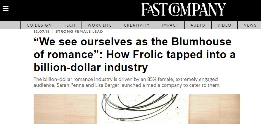
1. Thinnest and thickest line of the character should not have huge difference.
Look at this “O”
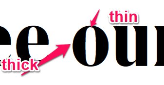
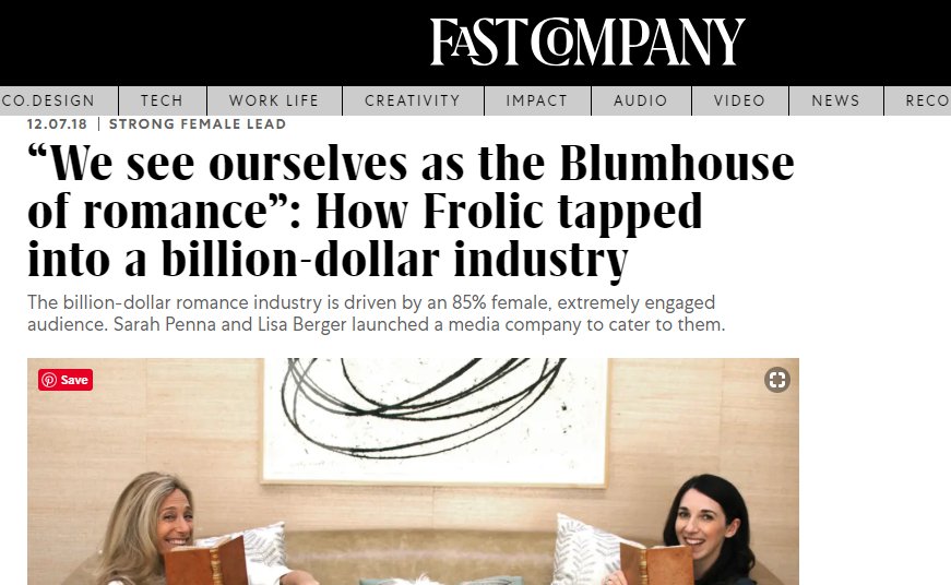
Why not to have it? – Just because a human eye will consider your text as vertical lines first ( fuck you = IiiiI ijii ) and then it will combine them into letters it can read. It takes time. That is why your brain will skip this part of your website and switch to the information it can consume easier. Sandly for Fastcompany.com and Washingtonpost.com they write titles of their articles with such fonts. Have a look:
2. Characters should not be narrow
It means that the height of a character should not be much bigger than its width.
Washington Post is making this mistake.
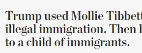
What is wrong about that? Simply, your words will look like vertical lines again. Have a look at the New Yorker. Is it easier to read?

The New Yorker followed another sin though but this is in another article.
3. Line space should be bigger than character height
I am talking about this space:
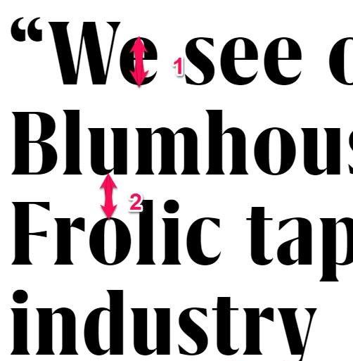
So the space #2 should not be smaller than space #1.